

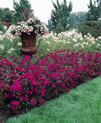
Colour is what most gardeners are drawn to in a garden and should be artfully incorporated into your garden design. Good garden design involves knowing how to combine colours so that the final product will be one we like. Only practice and experimentation will develop your eye for colour and allow you to see the differences between hues, but a good way to start is by studying the colour wheel used in art.
A basic colour wheel is based on three primary colours, three secondary colours, and the six tertiary colours. They appear in the same order as they do in the colour spectrum of the rainbow and are arranged by their relationships to each other; progressing from violet-red to red, orange-red to orange, yellow-orange to yellow and so on. Most modern colour wheels only contain 12 colours, but in nature there are many more hues. Using a basic colour wheel will help to train your eye to see the relationships between colours and how they transform and play off against one another.
To make practical use of the colour wheel all you need is a picture of it. Alternatively you could download specialized software from the internet which shows you multiple colour combinations.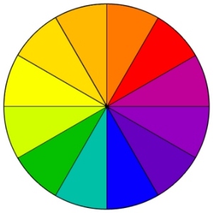 Colour WheelThe three primary colours are red, yellow and blue. In traditional colour theory, these are the 3 pigment colours that cannot be mixed or formed by any combination of other colours. All other colours are derived from these 3 hues.
The three secondary colours are green, orange and purple, created by mixing the primary colours.
Tertiary colours are yellow-orange, red-orange, red-purple, blue-purple, blue-green and yellow-green. These are the colours formed by mixing a primary and a secondary colour. That's why the hue is a two-word name, such as blue-green, red-violet, and yellow-orange.
Analogous colours are any three colours which are side by side on a 12 part colour wheel like yellow-green, yellow, and yellow-orange. Usually one of the three colours predominates.
Complementary colours are any two colours which are directly opposite each other, such as blue and orange or red-violet and yellow-green. These opposing colours create maximum contrast and stability.
Warm colours are the warm colours of the spectrum from red through orange to yellow. You can use a small amount of these colours to warm the temperature of a cool colour and vice versa. The warm colours tend to come towards you, or feel closer to you, and come forward in a garden. You can use warm and cool colours side by side to contrast with each other.
Cool Colours of the colour wheel tend to go away from you, or feel distant to you and recede in a garden. As with the warm colours, you can use a cool colour to change the temperature of a warm colour, just use it's opposite on the colour wheel. You can use warm and cool colours side by side to contrast with each other.
Combining and playing with colours in the garden
Basically you have two choices; to use harmonious colours that are next to one another on the colour wheel or contrasting colours that are opposite each other on the wheel.
Harmonious combinations can be monochromatic or analogous.
Monochromatic is when only one colour is used in its various shades, tints and tones. This scheme looks clean and elegant, producing a soothing effect. This is often a good choice for beginners as it avoids the chaos of using too many colours and trains the eye to see the differences within a single colour. In this type of garden 'less is more' and plants need to be repeated throughout the garden for their texture as well as their hue.
Analogous involves working with two or three colours that are next to one another on the wheel like red, orange and yellow. This is achieves a pleasing transition for the eye from one shade to the next. Remember that green is good to use as a transition between colours.
Contrasting Combinations can be complimentary or polychromatic
Complimentary colours are opposite each other on the colour wheel, like red and green, orange and blue, yellow and purple. Using only two colours like this will give maximum contrast in the garden but must be used carefully or the effect could be jarring to the eye. Try to favour one colour and use the second choice only as an accent. Once again 'less is more' and this type of colour scheme relies on the repetition and the texture and form of the shrubs selected, rather than too much colour. You could also work with one colour combined with two complimentary colours next to one another; like violet with yellow-orange and yellow-green.
Polychromatic uses every colour but requires much thought and planning to create a successful riot of colour, rather than a gaudy look. Neighbouring plants also need careful consideration in such a garden.
Triadic colour schemes make use of three colours that are an equal distance apart on the colour wheel, such as the primary colours red, yellow and blue or secondary colours like yellow-green, blue-violet, and red-orange.
Some tried and tested tips for using colour in your garden
Yellow is a beautiful, vibrant colour that seems to be full of life and happiness. If you apply the well-known rules of colour harmony and contrast, a yellow garden can be perfectly delightful. When planning a yellow garden include all shades of yellow, including pale yellow, golden yellow and lime-green. Yellows look good against green foliage but if it is not blended into the landscape can stick out like a sore thumb. To marry the green and yellow plant evergreen trees and shrubs that produce leaves in shades of cream, soft yellows, grey, silver and blue. Splashes of white, cream and grey harmonise well with yellow and will add sparkle to the landscape. On the colour wheel; purple and mauve are opposite to yellow and introducing small amounts of these colours as well as some blue, will make an all yellow garden more visually pleasing, adding dimension and depth.
Blue is the colour we perceive as being cool and calm. Planting lots of the lighter shades of blue will create a feeling of coolness, even in the full sun. Dark blue is a very strong colour and should be used with care, for if too much is used the planting will look brash and if too little is used it will be ineffectual. Blue tones can help widen or lengthen the look of a garden because blue falls back visually. Planting lots of blue flowers along the sides of a long, narrow garden bed will make it appear wider. Blue is the first colour to fade from sight as night falls, so if you use your garden a lot in the evenings incorporate a lot of lighter colours and white, which show up better at night. Blue and yellow are a very popular flower garden colour combination, with yellow providing a vibrant contrast.
Purple in the garden is calm, peaceful and serene. All shades of mauve, violet, lavender and purple can be used to create a cool restful look. However, if these shades are not broken they can look a bit gloomy, so pink is often used to brighten up the planting.
Pastel Colours are always calming, and a pastel flower garden can blend a wide range of shades ranging from pink, peach, pale yellow, to lavender and pale blue to create a harmonious, peaceful result.
White is the last colour to fade as night falls and shows up well in the moonlight and under artificial lighting, so if evening is the only time you have to enjoy your garden, white is a good choice. White, cream and silver will always lighten the effect if planted with other colours. White, if planted entirely on its own it has a sharp, crisp effect that can be put to spectacular effect in certain areas. However, masses of white can also be hard on the eyes, so you may want to incorporate other colours as well.
Cream does not have the sharpness of white, but a warm quality of its own, which blends beautifully with gold. It is wonderful to tone down hot colours.
Silver will sparkle in the moonlight and will always lighten the ‘effect’ if planted with other colours.
Green is a good compliment to white because it helps your eyes recover from the brightness, so include leafy green plants in your colour scheme.
Red, Orange & Yellow are hot colours that command attention and create an exciting, visually stimulating flower garden. Our eyes are drawn to warm colours, so plant reds, yellows and oranges in key areas that you want people to see. Try mixing lemon yellow, purple and strong pinks with hot colours, as this will help to soften and dilute them. White has the same effect and will add sharpness to the overall effect. Used carefully, hot colours can be extremely effective but be careful not to overdo them. Hot colours planted at the end of the garden will make the garden appear shorter because they bring forward visually, and if planted along the sides of a long, narrow garden bed, the garden will appear even narrower.
Have fun designing your flower garden, and if you bear in mind these tried and tested colour theories, you can let your imagination run wild. Perhaps you are very creative and like to bend or break the rules occasionally to make your own statement, and you can certainly do this if your eye is well-trained to the myriad of hues out there in nature. So experiment but most of all, have fun!
All experienced gardeners know that a truly gorgeous flower garden cannot be created in one season, and the colour needs to flow around a permanent structure, or backbone of shrubs, trees, and of course, flowering perennial plants. Click here to refer to our handy list of summer flowering perennials for full sun to light shade.
Members can click here to read more articles on using colour effectively in your garden
 Busy gardeners prefer to buy trays of seedlings to plant out, and others love to sow their own, but no matter which you prefer, my e-book "Growing Bedding Plants in South Africa" will not only assist you in selecting your personal colour scheme for the season, but also gives detailed sowing and growing instructions; plus approximate days to flowering.
You can add a bit of colour to your garden seasonally without 'breaking the bank' and if you follow the instructions in my e-book you will quickly be able to select those varieties which are perfect for your soil type and climate.